What you are trying to do
You want to look at how work actually flows through your team and answer two questions in one glance. First: what does our pipeline look like, end to end? Second: where, exactly, do tickets get stuck most often?
The process editor is the page that answers both. It is the one place in Ship where the shape of the work is the picture, not a sentence.
What you see when you open it
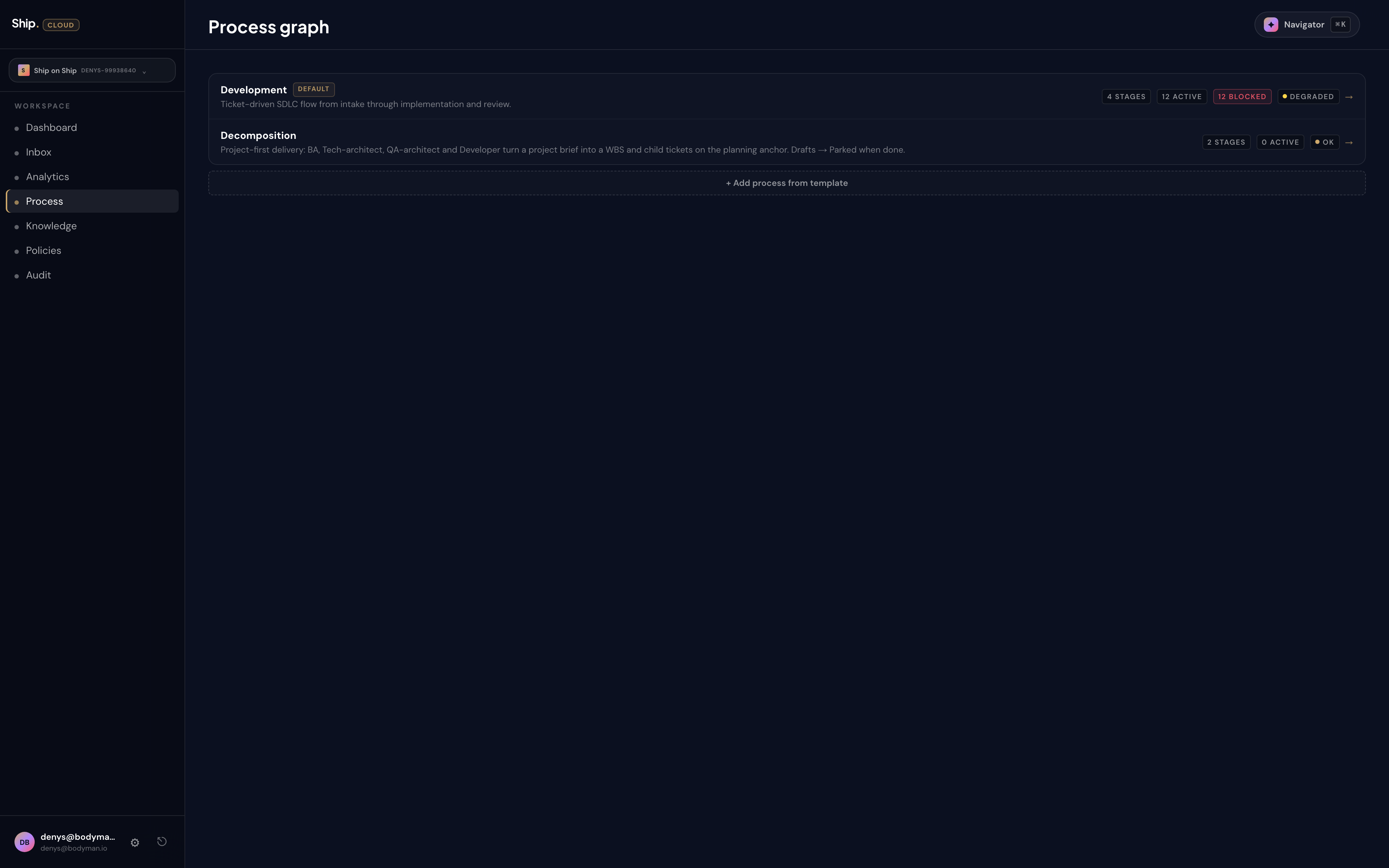
The top of the page is a flat list of the processes you can edit — one row each. Two ship by default: a Development process that runs the SDLC for delivery tickets, and a Decomposition process that handles project-level planning when you draft a brief (the default one carries a small "default" badge). Each row carries a status strip: how many stages it has, how many tickets are active in it, how many are blocked, and a health dot. Click a row to open that process's editor.
When you click into the Development pipeline you see the flow view: seven columns laid out left to right. Backlog. Planning. Executing. Reviewing. Awaiting input. Blocked. Closed. Each column shows the cards currently sitting in that state. Each column header carries the specialist attached to it — Planning carries the Planning bundle, Executing carries the Implementation specialist, Reviewing carries the Code review specialist, and so on.
The Capacity tab beside Flow tells you the same picture from a different angle: how many tickets each specialist is currently working on, how close any of them are to their limit, and which ones have headroom.
Why a graph and not a list
Three things are obvious in the graph view that are invisible in a list. The first is bottlenecks: if Planning has fourteen cards and Executing has zero, you do not need a report — you need a planner with more capacity, or a different planner. The second is edges: every line between two columns is a possible transition, and the line that lights up when a ticket moves tells you the rule that fired. The third is shape: most healthy pipelines look like a left-to-right river, with Awaiting input and Blocked as small tributaries off to the side. When your pipeline starts looking like a pinball machine, something has drifted.
Editing without breaking
The process editor lets you discard or publish changes. Most weeks you will not touch it — the default flow is intentionally boring and works for most teams. But when you want to change the shape — add a new stage, attach a different specialist, narrow the entry rule on a column — you make the change in the editor, watch the diff render, and publish when it looks right.
A change to the process graph is a real change to how your team works. Ship treats it that way: the diff is reviewable, every publish leaves a record, and if a change turns out to be wrong you can roll it back without re-explaining what your process means in a meeting.
What this changes about your week
You stop having "how does our pipeline actually work" conversations. The graph is the answer. New hires can be pointed at it on day one. Stakeholders who keep asking "where is feature X?" can be pointed at it instead of a status update. When a customer wants to know how seriously you take review and QA, you can show them the column with the named specialist standing in it.
You also stop arguing about process. When someone wants to add a step — "can we have a security review before Reviewing?" — the question is no longer abstract. You either add the column, attach the specialist, and let the next ticket walk through it, or you decide not to. Process is now an artifact you edit, not a culture you fight about.